5 Typography Tips to Transform Your Web Design
When it comes to web design, typography plays a critical role in enhancing user experience and establishing a brand's identity. Here are five essential typography tips to elevate your web design:
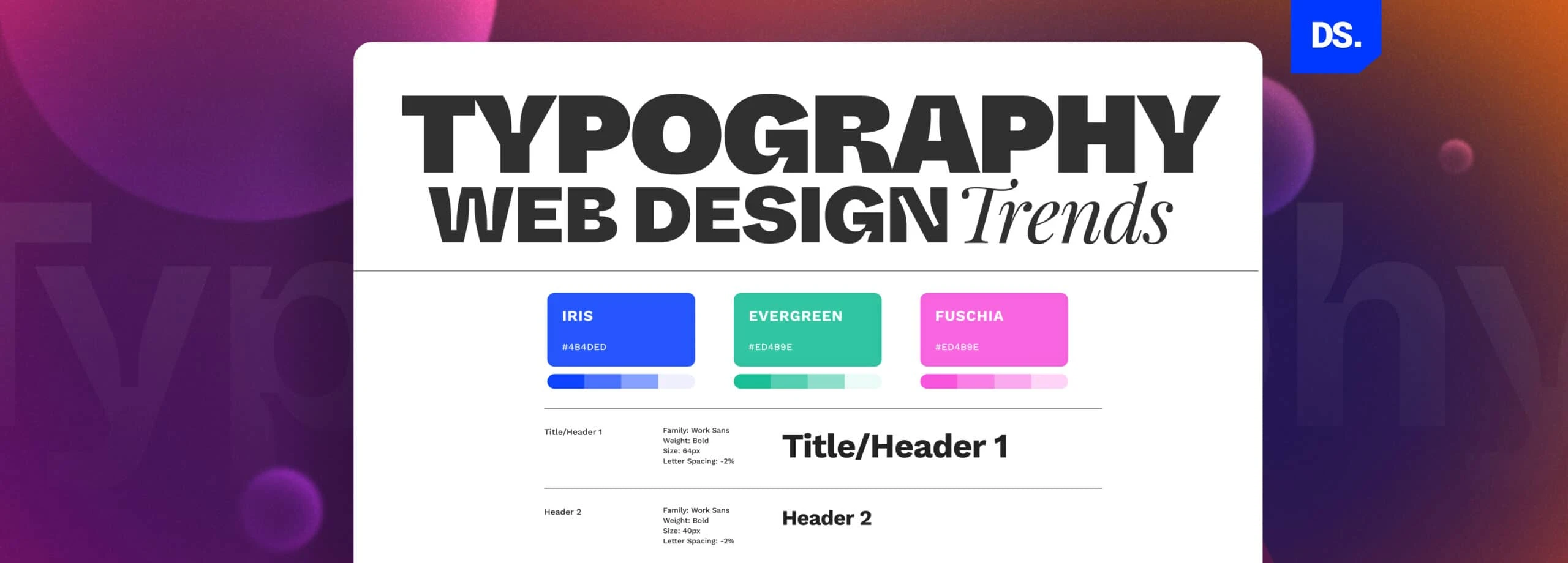
- Choose the Right Font: Selecting a font that aligns with your brand’s personality is crucial. For a professional look, consider serif fonts, while sans-serif fonts often convey a modern vibe.
- Maintain Hierarchy: Establishing a clear hierarchy with font sizes and weights helps guide users through your content. Use larger sizes for headings and smaller sizes for body text.
- Utilize White Space: Don’t underestimate the power of white space in typography. It improves readability and creates a more visually appealing design.
- Limit Font Choices: Using too many fonts can make your design chaotic. Stick to two or three complementary fonts to maintain consistency.
- Consider Line Length: An optimal line length enhances readability. Aim for 50-75 characters per line for body text.
Understanding Font Pairing: The Key to Effective Web Aesthetics
Understanding font pairing is essential for creating a visually appealing and effective website. When done right, it enhances readability, aligns with your brand's identity, and engages your audience. The key to mastering this art lies in selecting contrasting fonts that complement each other in style and weight. For instance, pairing a serif font for headings with a sans-serif font for body text can strike a perfect balance, making your content both attractive and easy to digest.
To achieve the best results with font pairing, consider the typographic hierarchy. This involves clearly differentiating between headers, subheaders, and body text to guide readers through your content. You might also want to limit your choices to two or three fonts to maintain cohesion and avoid visual clutter. Remember, a well-thought-out typography can significantly elevate your website's aesthetics while ensuring a seamless user experience.
How to Choose the Right Typeface for Your Brand Identity
Choosing the right typeface for your brand identity is an essential step in creating a strong visual presence. First, consider the personality of your brand. Is it playful, serious, elegant, or modern? Your typeface should resonate with these traits. For instance, a tech company might lean towards clean, sans-serif fonts to convey innovation and modernity, while a luxury brand may opt for classic serif fonts to communicate sophistication and tradition.
Additionally, it’s important to ensure that your chosen typeface is versatile and legible across various platforms. Test your typeface in different sizes, from headlines to body text, to see how it maintains clarity and impact. Variety matters too—select a font family that offers several weights and styles, allowing you to create a cohesive hierarchy in your designs. Ultimately, the right typeface will not only enhance your branding but also establish a strong connection with your audience.